Trending : Rose Gold

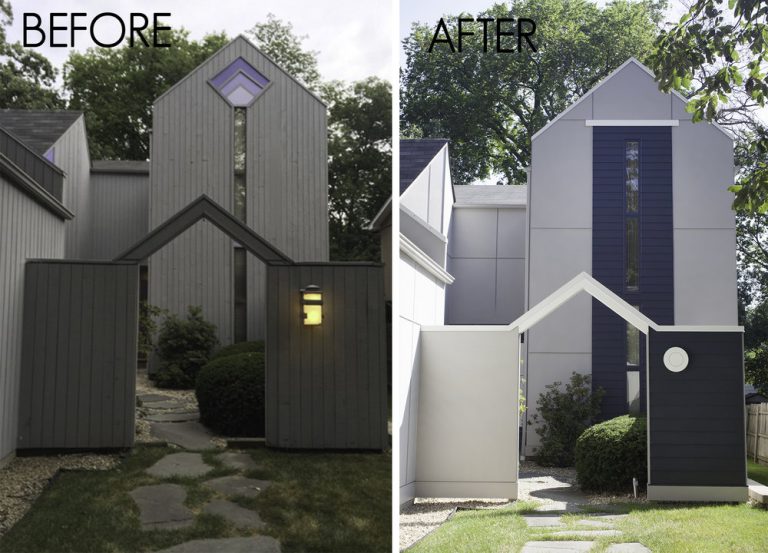
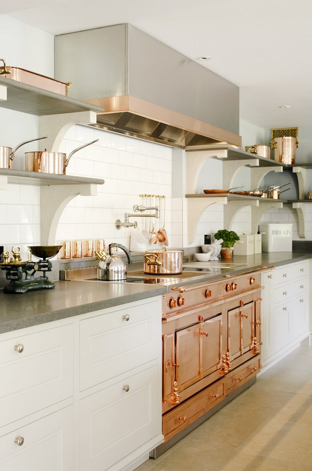
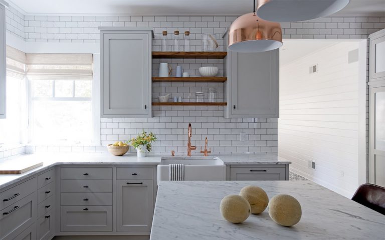
Do you see the world through rose-colored glasses? We have been lately. Well, rose gold to be exact. This finish is trending in a big way, and we love the way it adds the perfect touch of warmth and sophistication to a home.

Source 

Source

“Historically, rose gold gained mainstream popularity in the 1920’s when Cartier released their coveted Trinity Band, which consisted of gold, platinum and rose gold bands intertwined,” notes Knikki Granthan, Trend Manager for Hickory Hardware. “Then again it peaked during the War Period when the government banned the use of platinum for consumer use, many jewelry makers turned to rose gold for their statement jewelry. After a brief stint in the 50’s, rose gold faded again and became “vintage.”

Source

Source

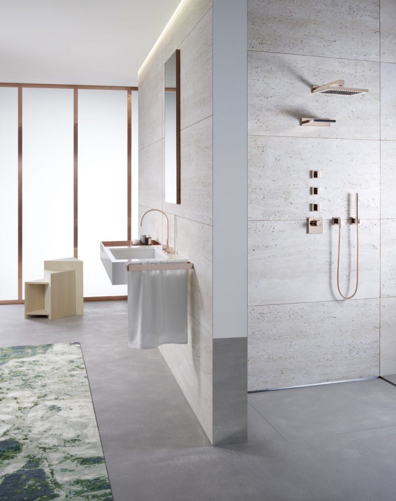
Now, rose gold has expanded beyond just jewelry. From hardware to lighting and beyond, this vintage color is now paired with clean lines and simple shapes, making it more modern and very versatile.

Source

Source

Want more rose gold inspiration? Check out our rose gold ideabook on Houzz!

What is Design / Build?

We’ve been actively working in the interior design world for over ten years now. When we formed Ember & Brune there was no question that it would be a full-service design-build business. We had witnessed the pitfalls of both the the design-build and design only method. Too many people involved in one project that are not collectively working together leaves room for more mistakes, miscommunication and in the end, a disconnected relationship between the company and valuable clients. Our approach is more streamlined. We design, manage and oversee the entire process.

Design Build Collage copy.jpg

Let’s break it down! WHAT IS DESIGN/BUILD?

  • It is a single contract between the client and the design-build firm.
  • We retain control over the end product, which ensures ours and our client’s vision becomes reality.
  • We have established relationships with quality focused industry partners. Knowing the contractor is a like-minded professional ensures client satisfaction.
  • There is no pointing fingers, no question on who is responsible because we are the main point of contact.

_MG_0456 (1).jpeg

We believe both components, the design and build, are equally important for a successful project. We are the main contact throughout the entire process, and establishing this solid relationship with our client one of our favorite parts of the job. Without you, there would be no us, and we honor that every day.

#KneadaNewKitchen Reveal

It’s light and bright, with character to spare! The design of this kitchen was extremely deliberate, with a creative use of space for all of our clients’ appliances and accessories. You can see the original space here.

IMG_1879copy5.jpg

The waterfall countertop is a feature we’ve wanted to incorporate in a kitchen design for a while. This was the perfect place! It adds so much dimension to the space, but also a simple sophistication. Not to mention a great deal of counter space for cooking or entertaining.

IMG_1896abcopy.jpg

The coffee station is cleverly hidden and easily accessible. A great way to declutter the countertops.

coffee collage.jpg

And the banquette is so inviting, can’t you just picture yourself relaxing in the morning sun with a cup of coffee?

IMG_1871a.jpg

IMG_1873a.jpg

But let’s talk about the glass backsplash… It’s incredibly sleek and understated, but still pops out at you in the best kind of way. The hood and floating shelves just all seem to work in harmony, we love how it all turned out.

IMG_1838a.jpg

IMG_1833copy4.jpg

IMG_1888 Edited.jpg

The storage solutions here are endless! We incorporated oversized drawers for bread storage and a secret charging station, as well as an appliance lift for the heavy duty mixer (not pictured).

collage.jpg

Tell us what you think of this kitchen design on Facebook by tagging @emberbrune and #KneadaNewKitchen!

Five Favorites

From the latest trends to timeless pieces that never go out of style, we are constantly scouting out products and inspiration for our clients. But at the end of the day, we have our own personal favorites we come home to. We created ‘Five Favorites’ as fun way to share a little of our individual style from time to time. First up, Brandie! Coming at us with her take on fall.

Five Favorites .jpg

I’m not big on pumpkin spice (I know, something is wrong with me), but I do love fall! Here are 5 of my favorite home items to pull out as the weather cools off and the leaves start to change: (Clockwise from left) TEXTURED PILLOWS. In the summer, the thought of a cable knit sweater anywhere near me, including on a pillow makes me itch. So I pull them out in the fall and keep them around all winter long. Sweater weather = textured pillows in my opinion. NEUTRAL TABLESCAPES. I take out the blues and greens of summer and add in some browns, greys and ivory. Who am I to compete with the colorful leaves on the trees?! I keep it neutral. HALLOWEEN DECORATIONS. I am not one to decorate for every holiday, but my family loves Halloween and we love adding some spooky decor to the house. We lean more ‘Hollywood Tower of Terror’ style than ‘pumpkin patch’. A few years ago my husband made this print to replace our usual artwork over the fireplace. We pop it in the frame every October! COZY THROWS. Not only are they convenient to have at arm’s length, they look great! This throw adds texture to my leather daybed and is oh-so-cozy.

FALL SCENTED CANDLES. I found this one recently at a vintage market in Dundee. It has the most wonderful fall scent!

Meet #TheRambler

#TheRambler came to us with a separation problem. The owners wanted to update and enlarge their master bath, which in its current state consisted of a dressing area, hallway closet, two bathrooms and a whole lot of wallpaper.

Rambler Before.jpg

Rambler Before2.jpg

The plan is to merge and connect these spaces to create a large master bath with tub and shower, as well as a spacious hallway with closet space.

render 6.jpg

render 2.jpg

render 5.jpg

render 8.jpg

We’ll be tagging #TheRambler on all updates, be sure to follow along!

#TimberView Reveal

Talk about a transformation! #TimberView is complete and just radiates sleek sophistication. Click here to see how it all began.

3_Revised.jpg

When the client requested seating for 10-12 at the kitchen island, we simply couldn’t resist the design challenge. We know there will be many memories made around that countertop.

4.revised copy.jpg

The hood was our custom design, fabricated by a local welder.

5.revised.jpg

6.revised.jpg

This last view almost didn’t happen. There was going to be a wall between the kitchen and dining room as you can see here in our initial renderings. However, after demo it was easy to see that the wall should come out completely.

2.revised.jpg

Meet #TrestleWilliams

#TrestleWilliams is receiving a remodeling trifecta- kitchen, mudroom and basement! One of the biggest issues in the kitchen was that the door from the garage opened directly into the room. We were able to solve this problem by moving the laundry room to the second level of the home. This made room in the previous laundry space for the re-located garage door and a true mudroom.

Before.jpg

Progress is well underway! We are excited to show you the plans with a good amount of progression to put things in perspective.

Plan Progress TW.jpg

Plan Progress TW 2.jpg

Plan Progress TW 3.jpg

Here is an update on the basement as well. So much improvement already!

Basement Progress copy.jpg

Follow #TrestleWilliams on social media so you don’t miss a beat, this one is moving fast!

#OutdoorRestore Reveal

#OutdoorRestore is complete! It has quite the bird’s eye view, don’t you think? Well, the original home had more than that…

Before After.jpg

The home was plagued with woodpeckers. More than a mere nuisance, these birds were destroying the wood exterior, a problem that had existed since the house was built some 30 years ago.

IMG_3532.JPG

Not anymore! With our re-design, #OutdoorRestore is now equipped with woodpecker proof, low maintenance fiber cement siding and a new contemporary style in keeping with the original architecture.

IMG_3556.JPG

IMG_3560.JPG

Goodbye Mr. Woodpecker!

IMG_3562.JPG

Meet #ClearView

Meet #ClearView! This home has space, all it really needed was a bit of clever re-organization. Currently, there is a small kitchen, closed off formal dining room and somewhat awkward family room addition. Here are the before pics…

IMG_3571.jpg

The plan is to open all these spaces to improve the flow and layout, providing a #ClearView for our clients! The kitchen will gain some much-needed square feet and some amazing new appliances.

McI2.jpg

mcI 1.jpg

Demo is underway! Follow the hashtag #ClearView for updates on this project along the way.

demo.jpg

The Perfect Paint Colors

We’ve all been there. Finding the perfect neutral paint color turns out to be so much more difficult than you thought. This one is a little too yellow, this one too blue, why are there so many whites!? Luckily for you, we have some tried and true favorites. Neutral paint colors that look amazing time and again. And we are going to share them with you!

BENJAMIN MOORE : MANCHESTER TAN

IMG_3163 copy.jpg

“Suggesting the striking sandstone façade and sculptural detail of historic Manchester Town Hall, this neutral on the khaki side is classic and elegant.” is how Benjamin Moore describes it. Manchester Tan is a neutral with noticeability, but not overwhelmingly so. We used it here in an open entryway and love how the afternoon light shows all the nuances. BENJAMIN MOORE : REVERE PEWTER

image-asset

Sophisticated and soft, this is a grey that never feels cold. You can never go wrong with Revere Pewter, a “classic shade that creates a unifying look that calms and restores.” It really seems to add elegance in a way that’s extremely liveable to this living room we designed. BENJAMIN MOORE : GRAY OWL

collage.jpg

Slightly more subtle and a touch warmer than Revere Pewter, Gray Owl is amazingly versatile. It works with virtually any color scheme, opening up the room to make it look bigger. We love it so much that we’ve even used it in our own homes! These sweetly styled corners are from Carrie’s nursery. BENJAMIN MOORE : WHITE DOVE

IMG_3102copy*2.jpg

“Unerring style defines this classic, softly shaded white.” Yes. Yes to all of that. This shade helps you go white without blinding the neighborhood. We used it on the cabinets in this kitchen for a super fresh and inviting update.