We’ve all been there. Finding the perfect neutral paint color turns out to be so much more difficult than you thought. This one is a little too yellow, this one too blue, why are there so many whites!? Luckily for you, we have some tried and true favorites. Neutral paint colors that look amazing time and again. And we are going to share them with you!
BENJAMIN MOORE : MANCHESTER TAN

“Suggesting the striking sandstone façade and sculptural detail of historic Manchester Town Hall, this neutral on the khaki side is classic and elegant.” is how Benjamin Moore describes it. Manchester Tan is a neutral with noticeability, but not overwhelmingly so. We used it here in an open entryway and love how the afternoon light shows all the nuances. BENJAMIN MOORE : REVERE PEWTER
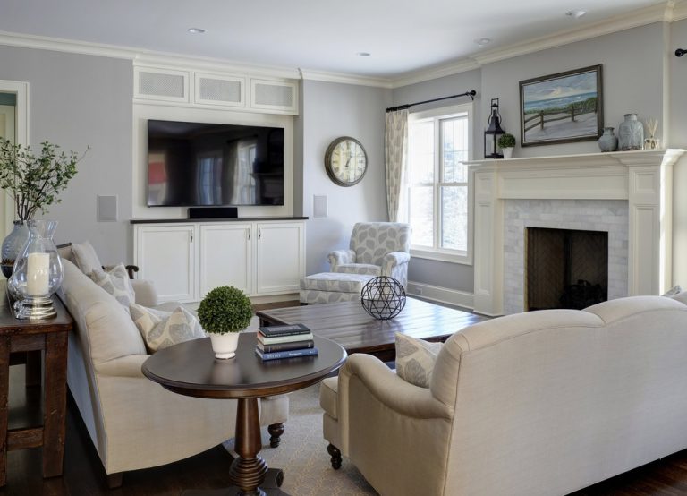
Sophisticated and soft, this is a grey that never feels cold. You can never go wrong with Revere Pewter, a “classic shade that creates a unifying look that calms and restores.” It really seems to add elegance in a way that’s extremely liveable to this living room we designed. BENJAMIN MOORE : GRAY OWL
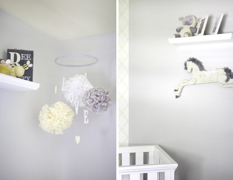
Slightly more subtle and a touch warmer than Revere Pewter, Gray Owl is amazingly versatile. It works with virtually any color scheme, opening up the room to make it look bigger. We love it so much that we’ve even used it in our own homes! These sweetly styled corners are from Carrie’s nursery. BENJAMIN MOORE : WHITE DOVE
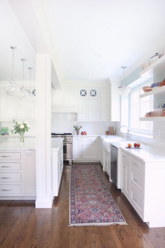
“Unerring style defines this classic, softly shaded white.” Yes. Yes to all of that. This shade helps you go white without blinding the neighborhood. We used it on the cabinets in this kitchen for a super fresh and inviting update.